For this CUPdate, I did some more research on what kind of style I want to go with for my Nay Recruiters game that I've been working on. I've been holding off on doing style tests for a while because I wanted to get the core game mechanics programmed before I get too deep into art, in case anything changes. But I decided it's time to at least start concepting some of what I want it to look like, even if it's early and might be changed later.
This actually started because I was drawing some story sketches for my main storyline to get back into drawing. It made me realize how much I enjoy sketching and that it helps me give life to my drawings, while I struggle more with lineless drawings.
This ties back into the style test for my game. For games, I always prefer making pixel art, and not so much fully detailed drawings. For our GGJ project this year, Slumbered Apart, I went with a more detailed drawing style and it was a lot more time-consuming, and honestly didn't feel like it had as much life as the pixel art games I had made in the past.
So I decided that I'll likely want to do a pixel art style for the sprites and backgrounds, but for any UI and character portraits, I can do my more fleshed out drawing style. I also recently played through Half Past Fate, which was a really cool game, and it inspired me to revisit my interest in pixel art a bit more as well.
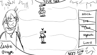
So I looked back at my initial layout for the battle system. I did some sketches of a battle layout for one of the first battles in my story plan, to try and add some background and context.
I then decided I wanted to add placeholder characters so I could properly lay out the scene, and changed up the character UI a bit.
After that, I decided that I kinda wanted to rework the perspective rather than having them just be facing straight-on. I wanted it to be more dynamic and to make something slightly more isometric. I started researching turn-based RPG battle systems and looking at how they're usually laid out, and the 3/4 back or back view appealed to me more than the classic side-view. So I started to rework some of the battle layouts with sketches.
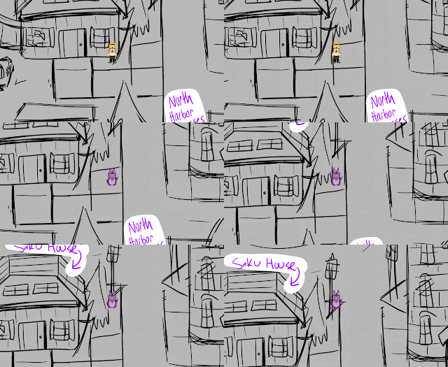
Then I wanted to start sketching up some tests for the overworld and some thumbnail story moments, so I started with a map of the starting area in Compass World: North Harbor! I think in the end, this map is gonna be flipped upside-down so that the north will be facing up instead, but this is just the first concept to get places laid out.
Next, I started to figure out what the game layout would look like outside of battle, so I concepted up one of the scenes in the Mayon Woods. I figured out where some basic UI elements would be placed and the general perspective. While doing this, I also figured out how to map to specific keys in some of the built-in RPG Maker code, so I'll be utilizing that for sure.
Then I started to think about dialogue. I decided that having full faces of the characters will work well, just like I decided for the battles. So I started with a concept where the nameplate is above the text.
And then I decided to try one with the name below the character instead. I kind of like how this one came out better, so might stick with this going forward for now. I also dimmed the scene, added black bars, and turned off the UI, to make the transition to a cutscene more apparent.
Then I did a few tests where I turned part of the above concept (just Gair to start) into a pixel art drawing, like I'm hoping to do for the final art in the game. I had some trouble getting one that looked how I wanted, and the bigger the sprite was, the more time it took me. I ended up shrinking it down to a size that might work better, but I'm still not entirely sure this is the style I want to go with.
So I built onto the one I liked the best (the far right) and added a background and characters, based on the initial sketch I did.
Then I added dialogue boxes to figure out how that'll look. I was playing around with a lot of different variations and I think right now I'm leaning most towards 4 or 7.
So while I didn't do a lot of finished art (but I did start!), I'm starting to create layouts and get a better idea for the art direction of my game, which is helping to make it all feel like it's progressing further! With this first art test out there and some rough art imported into the game itself, I'm feeling better about progression in general for this project.
Next time, I'm planning on presenting a Twine that I'm working on for my story outline, with all of the music added. My hope is that I'll have all of the really rough location sketches so I can at least show the sequence of events for the Prologue in there. I've got the story all written out, it's just a matter of getting some visuals in there to present. Until next time!


No comments:
Post a Comment