Friday, June 25, 2021

CUPdates 5: Story Outline, Character Sprites, and Locations

We had three weeks to work on CUPdates, so I ended up finishing a lot more than usual. My goal was to just finish the story outline, but without images to accompany the outline, that would've been kinda boring. So I made a lot of concept sketches to figure out locations, character progressions, and more!

So after the last CUPdate, I got some feedback from my friends on the dialogue boxes. These were the results:


I did a few more tests based on the favorite ones, because the winner (4) wasn't quite sticking with me. So I made these ones:


Based on the initial reactions from a couple of my friends, I decided to go with either D or H. So I made some more tests with those two, to test out the longest character name (that I could think of) in the game, as well as a different color style. I think I've finally settled on which one I want (2), but these were the two options:


I also imported all of these art assets into the game and animated the different assets to see what it would look like in-game! I'm still tweaking the timing, and I'm not 100% sure on the actual dialogue box, but I'm progressing with this. I also need to tweak the font because it uses quotes as apostrophes for some reason.

After that, I decided to start thinking about the story more so that I could plan out where to go next. I planned out detailed story beats in the form of a Twine story, so I could listen to the music that plays at the same time as writing out these descriptions. It helped me really start to enjoy this new path that the story is taking.

Then I planned even bigger. I made a Notion page with the main Eventure/Chapters, and broke down some of the big plot points. Then I planned out when each character comes into the story and decided who was to be an optional character, and who was required for the story to progress. I also fully planned out locations and which ones were required vs. optional. Once I had all of that, I figured out a timeline and how much time passes in the story. I also found places where I could include time skips, so that more time does progress.

Because I realize a lot of time goes by in this story, I decided that I want to have costume changes and height changes throughout the story. I realize this is probably a huge wishlist and I'll be lucky if I include 2 different costumes per character, but I think it'd be really cool to include. So I started to put together drawings I have of my characters in their various costumes and determined what point these costumes are worn throughout the story. I haven't finished this obviously, but it's something I plan to work on more at some point.

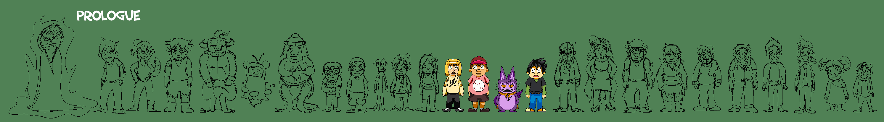
Then I decided to sketch out a character lineup sheet to show size comparisons between all of the characters that are planned to make an appearance in the prologue. There will probably be a few more characters, but these ones have story moments planned already.


From there, I started to think about my biggest struggle: Backgrounds. I started by going into The Sims and built the Ragger/Braves house so I could have some 3D references of what I want the background to look like. I did this a while back with the Saku house here, and it helped a lot, so I wanted to do that again!


Before getting into drawing the interiors for these bigger house locations, I decided to start with one of the smaller ones: Rocko's cabin. So I tried out a more perspective look, referencing some Mother 3 and Deltarune backgrounds as inspiration.
Something felt off and the characters didn't seem to fit into the backgrounds from their current perspective and I wasn't really happy with how it was looking. So I tried redrawing from more of a front view instead, and I think it works a lot better with the characters, so this is the direction I'll likely take for interiors, going forward.
And then I added colors to that test to try and get a quick sense of if this was working or not. I think for right now this seems like a good direction to go in, since it's more simplified and quicker to draw. Because backgrounds are a struggle for me, I think going more simple with them will really help out a lot in the long run.


I started to draw the other maps that appear throughout the prologue. I started with expanding upon the Mayon Woods some more, so I designed the forested area that Nick takes The Nays to for hiding.


And then I planned out the cave that Capillstation guards and what the portal area looks like.


Then I decided, for now, I'm going to stick with the beginning of the game being the flashback scene where Rocko and Haru fight to become a World Leader in the World Leader Exam, so I designed the room that they start in.


And I also drew the battle platform, based on an old sketch of this area that my brother drew of this location.


I had this idea to create intro screens for every character that you meet in the game. Maybe it'll only be this dramatic for party members, but I do really want some kind of intro to show the characters when they're introduced for the first time, to help keep track of characters.


Then I did a test where I made a sketchy walk cycle of all directions for Gair so that I could get a better feel for the types of angles I want to go for. I also updated the map of North Harbor to be a bit smaller.


And then I decided to get back into the programming side, so I revisited my battle system a bit. I was looking for a plugin that could add health bars above events that are controlled by variables, but I couldn't find any, so I decided to just program my own from scratch with events and JavaScript. Thanks to Eliaquim's help on the RPG Maker forums, I was able to figure out how to get the health bar moving smoothly and being attached to the event on the map!

This is an old gif before it was fully working:


Friday, June 4, 2021

CUPdates 4: Nay Recruiters Map Layouts

For this CUPdate, I did some more research on what kind of style I want to go with for my Nay Recruiters game that I've been working on. I've been holding off on doing style tests for a while because I wanted to get the core game mechanics programmed before I get too deep into art, in case anything changes. But I decided it's time to at least start concepting some of what I want it to look like, even if it's early and might be changed later.

This actually started because I was drawing some story sketches for my main storyline to get back into drawing. It made me realize how much I enjoy sketching and that it helps me give life to my drawings, while I struggle more with lineless drawings.


This ties back into the style test for my game. For games, I always prefer making pixel art, and not so much fully detailed drawings. For our GGJ project this year, Slumbered Apart, I went with a more detailed drawing style and it was a lot more time-consuming, and honestly didn't feel like it had as much life as the pixel art games I had made in the past. 

GGJ 2021 (detailed drawings)

GGJ 2019 (pixel art)

So I decided that I'll likely want to do a pixel art style for the sprites and backgrounds, but for any UI and character portraits, I can do my more fleshed out drawing style. I also recently played through Half Past Fate, which was a really cool game, and it inspired me to revisit my interest in pixel art a bit more as well.

So I looked back at my initial layout for the battle system. I did some sketches of a battle layout for one of the first battles in my story plan, to try and add some background and context.

I then decided I wanted to add placeholder characters so I could properly lay out the scene, and changed up the character UI a bit.


Then I wanted to start sketching out some ideas on how to display the dialogue in battle, since that's a large part of my custom battle system. I started with an idea to have the text bubbles pop up next to the player sprites with a mini head on the bubble.


I realized you wouldn't be able to see the face of the players since their backs are facing the camera, so I tried another version with their faces on both sides of the screen. I like how the dimming of everything other than the speaking characters came out too, and with the removal of battle UI elements, so this is something I'm planning to move forward with.


After that, I decided that I kinda wanted to rework the perspective rather than having them just be facing straight-on. I wanted it to be more dynamic and to make something slightly more isometric. I started researching turn-based RPG battle systems and looking at how they're usually laid out, and the 3/4 back or back view appealed to me more than the classic side-view. So I started to rework some of the battle layouts with sketches. 

I like the direction that this is going in, and it feels much more like a dynamic battle. So I continued to build upon it, reworking some of the layouts of the menus and various elements to fit this new screen layout. I also figured out what it would look like when you choose between attacking enemies as well.

Then I wanted to start sketching up some tests for the overworld and some thumbnail story moments, so I started with a map of the starting area in Compass World: North Harbor! I think in the end, this map is gonna be flipped upside-down so that the north will be facing up instead, but this is just the first concept to get places laid out.


Then I drew over the map to plan out all of the places they visit during the prologue.


Next, I started to figure out what the game layout would look like outside of battle, so I concepted up one of the scenes in the Mayon Woods. I figured out where some basic UI elements would be placed and the general perspective. While doing this, I also figured out how to map to specific keys in some of the built-in RPG Maker code, so I'll be utilizing that for sure.


Then I started to think about dialogue. I decided that having full faces of the characters will work well, just like I decided for the battles. So I started with a concept where the nameplate is above the text.


And then I decided to try one with the name below the character instead. I kind of like how this one came out better, so might stick with this going forward for now. I also dimmed the scene, added black bars, and turned off the UI, to make the transition to a cutscene more apparent.


Then I did a few tests where I turned part of the above concept (just Gair to start) into a pixel art drawing, like I'm hoping to do for the final art in the game. I had some trouble getting one that looked how I wanted, and the bigger the sprite was, the more time it took me. I ended up shrinking it down to a size that might work better, but I'm still not entirely sure this is the style I want to go with.

So I built onto the one I liked the best (the far right) and added a background and characters, based on the initial sketch I did.


Then I added dialogue boxes to figure out how that'll look. I was playing around with a lot of different variations and I think right now I'm leaning most towards 4 or 7.


And lastly, I decided to do the thing I struggle with most: drawing backgrounds. I ended up starting with the Mayon Woods because it's more organic, and those are easier for me than drawing anything industrial. So I made a quick sketch of the layout of the Mayon Woods, and indicated various story moments and where they take place.


Then I decided to make North Harbor, which was a bit more of a challenge. I still haven't drawn the interiors of these maps, so that's where most of the story moments actually happen here.

I imported these maps (and the first sprite style tests) into my RPG Maker project to test them out, and realized they might actually be a bit too big, since they move through the maps pretty slowly. I was thinking another option could be to just up the player movement speed instead, so I'll have to play around with that. I think they move at the right speed through the Mayon Woods, but maybe not so much in North Harbor, so we'll see!


Then I downloaded Hudell's Cyclone Maps plugin to add collisions with Region IDs. It seems like this is the plugin I need for everything parallax background, so I'm hoping it works with my other plugins in the end! It seems to work so far, so I laid down some test Region IDs for the collisions.

In addition to these drawings and game development, I planned out all of the music that plays for the prologue chapter to help get in the mode for drawing some thumbnails. I found all of the songs on Tunetank, which is a Royalty Free website. I'm not sure if I'll commission externally for the final music in the game, but for now, these are really great placeholders that don't sound like the usual Royalty Free songs, so I've been really happy with how they sound!

So while I didn't do a lot of finished art (but I did start!), I'm starting to create layouts and get a better idea for the art direction of my game, which is helping to make it all feel like it's progressing further! With this first art test out there and some rough art imported into the game itself, I'm feeling better about progression in general for this project.

Next time, I'm planning on presenting a Twine that I'm working on for my story outline, with all of the music added. My hope is that I'll have all of the really rough location sketches so I can at least show the sequence of events for the Prologue in there. I've got the story all written out, it's just a matter of getting some visuals in there to present. Until next time!