I know it’s taken me a long time but I finally have a final card design. It’s really mostly thanks to my friend Jinny, but I’ll get into that during this CUPdate!
So I started out by getting feedback from my friends on the overall card design. They helped me decide which elements to combine from each of my tests and I decided to go with the lighter card color for the symbols with the white for the actual symbol to help it stand out the most. And then the coloring on the strength/weaknesses. So I had it mostly figured out finally, but I realized I wanted to see how the card would look without the border and it made me think about how I wanted to design the outer aspects of the card in case it’s not actually cut off. So I worked out a bunch more design variations to try and figure it out further.
I printed a few of the designs and noticed a few things. First, the printer didn't pick up on the contrast, so I'll have to hope the final printer does (or adjust accordingly). And secondly, I realized a lot of the little elements I was playing around with didn't really read very well when printed. So I decided that the little details weren't super important. I'm thinking about going with (6) from the ones above (the bottom-right in the image below).
So first I started with some minor tweaks to the original design. I changed the top part of the card so that it slightly mirrors the bottom part but isn't too distracting with a lot of extra elements that would distract from the overall design.
I thought about potentially adding colors matching the strength and weaknesses but it kind of clashed too much with the other colors so I decided to probably not go with it. But I’m still thinking on if the symbols are recognizable enough without their respective colors or not.
I saved each individual part out for all of the types to test how it looks with different colors, characters, and traits. When I took them into nanDECK, I realized I had to adjust a few of the positions like for the traits. So I made those updates. There are a few of the colors I’m still playing around with, but I’ll work on those and come back to them later.
Then I printed one of each type color out to see how they’d look as prints. There are a few card colors I need to work on though (mainly Ice, Dark, and Water). And then I’m considering making the trait circles a little bigger so there’s more space around them, but I’ll have to play around with that and see if it messes up the existing layout at all to do that.
I adjusted some of the colors because the ice and water were a bit hard to read. I tried changing the color of the type to white or darker and kinda liked it more.
While I made some progress, it still wasn’t quite finished enough. So I was lucky that my friend Jinny took a look at my designs and spent a night sitting down with me and recreating it on her computer. She helped me figure out what I could do to improve the card design! I’ve been having trouble with it and she took my inspirations and built a design from scratch. These are the designs she made:
And then I printed them all out and compared them to my existing ones (hers on the bottom mine on the top). The heart/fire, ice/water, and earth/metal all look a little too similar so I needed to work on those, but I’m liking how they came out!
So then I worked on updating the colors. I wasn’t 100% on the font either so I tried changing it back to what I had. I slightly updated some placements and small tweaks as well. Then I printed those versions out as well.
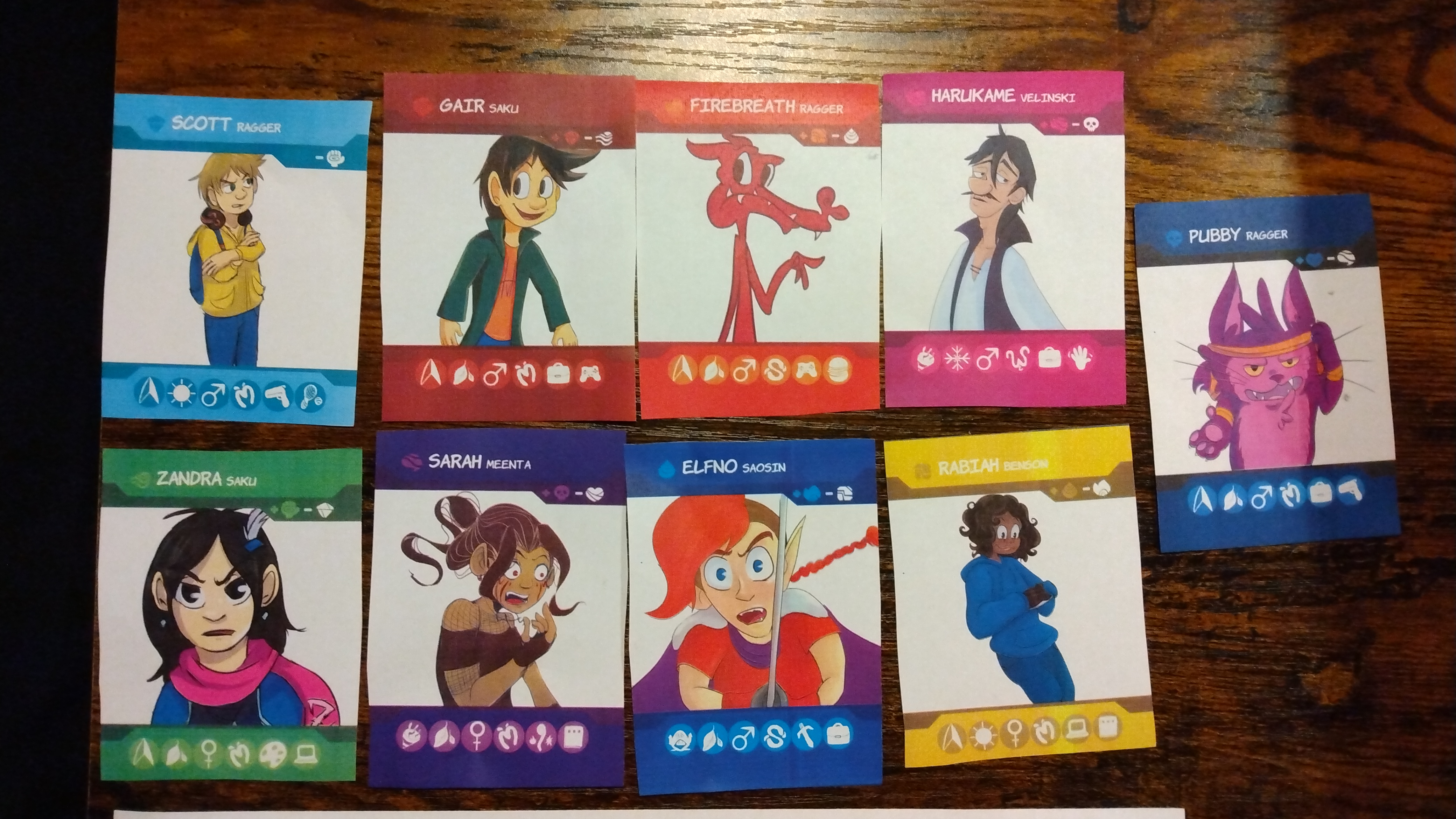
I tweaked some colors and plugged the actual values into nanDECK to get their actual traits. I tweaked and printed a few times but finally ended up with what I think is finally the final card design!
And I printed one of each type to make sure. I’m really happy with how far I’ve come and that I can officially say the designs are done! The only tweaks I would make is slight changes to colors to make them a little less alike or easier to read, but otherwise they’re good to go.
Then I started to come up with ideas for names of each of the game modes. I have at least better placeholders now even if they change.
I made a table to try and organize all of the game rules that I came up with so far since it’s been a couple of months since I did a playtest. I converted it to a printable sheet to help with playtests as well.
So then I played one of each mode after printing the final card designs. I took some notes on minor changes and actually ended up finding a new way to play one of the modes that makes it a lot more interactive and fun. This involved using some of the scoring tokens that I’m making for one of the other modes anyways.
And otherwise, I continued to finish some drawings of characters that I had to continue to add to the roster. Most of these were sketches originally that I just colored or finished digitally. But a few of them were brand new drawings.
So overall I’m getting closer to the end! I have some fun updates coming for next time that I decided to save. I’m hoping to start doing some of the actual final print tests through the official site by the 10th dev log. So soon!
My brother and I revisited our Global Game Jam project, World Bub! We spent a couple of weekends after the GGJ was over to fix up some bugs, add some new art, and finish a few features we had originally planned.
💾 Download and play the game here:
Day 1
So I started out by fixing the key binds. The VisuStella Options plugin had the ability to rebind keys, and it ended up conflicting with our custom key binds, so I removed that feature and focused on the key binds we intended to get that working.
Then I updated the player and enemy turn visuals. They were previously overlapping some of the deck UI in a way that I didn't like much, so I updated it to cover less of that area.
I updated a few minor visuals like removing UI when it shouldn't be there or adding it when it should. Then I added a card visual for when you unlock new cards so you can more easily see which card you received and what it does.
Then I added more of the card abilities that we removed from the game initially. This included abilities like adding an extra move, attack boosts, defense boosts, etc. It ended up having me rethink how attacks were done so it could check for the boosts before a player or enemy attacks, to apply those to the damage.
When I was making the additional move, I also found a bug where you could infinitely move, so I ended up fixing that in addition to adding this new ability.
I updated the battles so that some enemies hurt more damage than others and they start in different locations depending on which rank they are. I didn't fully test these to ensure they're balanced, but I did at least start implementing this.
We originally wanted to implement characters on the maps so that you could talk to the characters you've defeated in one central area. I put in some placeholders and dialogue for when they talk to you. During this time, my brother was creating the final art for our overworld map and updating the lighting.
I added a bit more dialogue as well. I wanted to have different dialogue after you beat characters so they wouldn't repeat the same intro the second time you fight them.
Then I started to draw all of our character sprites. I made really simple animations for them and just created one direction for them to face so they could appear on the overworld and in one of the buildings as you collect them.
Day 2
On the second weekend, we finished everything up! I started with adding dialogue options where you can choose whether you want to battle a character or not, so you can back out if you change your mind. My brother made our show choices image and I made the functionality.
I also added the functionality for showing images when a location is locked and you can't progress yet to make that a bit more obvious. My brother did the visuals on this one as well.
Then I fixed some of our scrolling background issues and lights. The next area I updated was the randomization when you receive a card from beating Gair. There are 4 options so I previously just had it choose 1 randomly. I updated it to choose a new card each time until you have all 4 so it would be more worthwhile to challenge him to a rematch.
Then I implemented the types into the battle! We previously had types shown on the cards but they didn't actually do anything. So I changed it so all of the player's cards can damage the enemy for extra damage if they hit their weakness. I also updated the enemy's attacks to have a random chance that they'll do more damage to the player if they have an advantage to water (Piko's type). I added some flavor text to let you know if these are happening too.
I also created a visual in battle that shows the enemy's type so it's easier to remember what types you want to use against them. I was forgetting a few times in battle and wishing I remembered, so I thought this would be helpful for the player to use those type advantages more. My brother also updated the card layouts to include more symbols and visuals to indicate what cards are doing.
Then I drew a few more character sprites! I drew Ducklin, Octobub, Octoglace, and Chilzby.
I updated the options screen to show the controls on it so it'd be easier to know which ones to use. I also fixed up some of the keyboard controls.
From there, I did some final testing and bug fixing. We were having a few bugs that would randomly happen, but they were really inconsistent and hard to recreate. So I tried to proof it up as much as I could, but it was a challenge to fully test when it was only happening once every ~10 playtests. And usually it would be when my brother was testing and not me, so it was hard for me to debug personally.
But overall, I'm really happy with the improvements we made to this game! This has turned out to be one of my favorite GGJ projects and maybe the most fun gameplay-focused one! I really enjoyed working on this project and I can't wait to see what's next!
So on a Sunday night after dinner, I made a list of potential options on what I could do for the night. One of them was to learn a new game engine for fun (Pixel Game Maker MV). I ended up choosing that one and it turned into a night of about 5 hours of game dev and making a short game!
🎮 Play the game here:
🎥 Watch the playthrough video here:
I had previously looked at the engine and started a few projects using the template project, but never really did that for longer than an hour a a time. So I had a few test projects that were all the same of just the default assets and nothing really beyond a map with nothing playable.
So I decided to actually sit down and learn how to make the very basics of a game, similar to how I learn any game engine. And while doing that, I learned that this engine is not really widely used. Or if it is, there's not a lot of people talking about it or posting tutorials or documentation on how to use it.
I found a few YouTube videos and then there are the built-in tutorials, but it's pretty limited overall and some of the core features were missing or difficult to figure out how they worked.
So I started out by actually collecting art I had already made so I could easily import sprites without having to immediately create anything new. I unfortunately didn't get any screenshots while the assets were still in there, but I was using some of these placeholders to start.
So I was able to get some sprites into the Resources folder, which is how you store all of your images and other resources in PGMMV. It's similar to how RPG Maker has a Resource Manager, but I honestly never really use that. It's interesting that I couldn't find a way to just drop images into the folder itself, but they all had to be manually imported in.
Most tutorials started with lengthy descriptions on drawing/importing all of your animations and states before just getting a character moving on the screen, so I struggled at first to figure out the basics. I skipped around a lot to try and get that in there first with some basic sprites. I set up the object states in there using a sprite of Piko from my GGJ25 project for this.
I was using some placeholder platforms I made as the first platforms to jump on, and eventually replaced them with a new underwater-looking tile. I made a very small tileset to just have enough in there to have a playable game.
Once I had a player that could jump on platforms, I wanted to make a collectible item. It ended up being a bit more complicated than I was expecting. I was trying to find a simple player collision with an object event that I could use to detect if the player collides with the item, but the player would bounce off of them because there had to be a collision. I finally figured out that there's a field of vision feature that can be used for this type of collision, so I set that up for the item collision, and eventually for teleporting to the final scene.
Then I wanted to create a score for the collectible items to add to. So I learned about on-screen text, which is also a bit different from what I'm used to. You basically set up a resource in the Resources that's for text, and then reference it in your objects. And then to display it on the screen in a HUD, you create a new layer on a scene for the menu. It's an interesting method. So I turned the score into a variable and had it display after the "Score:" text.
Then I made a new scene for the credits because that displays text too. I reused sound effects and music from the GGJ project too, so I had those creators ready to add. I had the scene transfer there when the player reached the end of the level. I used a larger bubble in the level to show that.
From there, I wanted to make an enemy. The first thing I learned here was how to make the player attack the enemy and destroy them. I used some of the built-in tutorials for this, and so I had to actually make animations for my player to see if they were attacking or not because the enemy wasn't getting destroyed right away. So I just used some alternate views of the Piko sprite for this, but set up some basic states in the animation editor. I eventually got it all working though.
Then I wanted the enemy to be an obstacle that destroys the player when they collide. I had a hard time figuring out how to just restart the level. My temporary workaround was going to be teleporting between scenes. But then I discovered that some of the built-in switches are actually meant to be events. So I found the "Restart" switch that when it's on, it restarts the game. So that was exactly what I needed.
So because of this new discovery, I was able to create an end to the game. Once the player's on the end credits screen, they can press a button and it closes the game.
I also made the title screen. I decided to just make all of this in Photoshop because I was wrapping up this little project and wanted to do it quickly.
I ended up adding some slopes while I was playing around with the level design as well. And I made the level much smaller to only be 1 screen where the camera didn't even need to scroll. I was originally making it pretty large but then ended up just scoping it down as a little short test level.
I had a few weird gameplay bugs where the game would sometimes start and the player can't move or control anything. I still really don't know what causes that, but I found it works better with a controller. I tried the PS5 controller and the controls were pretty messed up though, so had to resort to trying with an Xbox controller for it to be fully supported. I tested along the way and eventually had a full level with art mostly replaced and made just during this.
So then I decided to just record a gameplay video and upload it to itchio! This was a fun little Sunday night project that I completed in about 5 hours. I love learning new game engines and just new things in general, so I had fun with this side project.
Overall Thoughts
While this engine is very cool that you can do everything without code and that I was able to make a short game in a very short time, there were a few things that I didn't enjoy and are reasons I likely won't be going forward with this engine.
I've always really wanted something as easy to use as RPG Maker, but for action games like action RPGs or platformers. But I don't think this was quite there. It's possible it gets easier with using it more, but the complex animation and state system made it fairly difficult to really find everything and make simple interactions quickly. After I found where things were, I was able to understand more how it works, but I do feel like there's a lot of setup until you can get something moving and playable, which is a big downside for me.
I've recently been learning GDevelop, and while this does have more complex features built-in, I do think that GDevelop is overall a lot easier to get started right away with. Because GDevelop is free and open-source, I'd also overall recommend that over PGMMV for someone starting out and looking to get an action game made quickly. I understand GDevelop came out after PGMMV, so PGMMV was really the easiest you could get at the time. But now there are other alternatives!
Something I didn't try out was that there seem to be built-in dialogue boxes and choices, using plugins, similar to RPG Maker. So that could be a big plus though. I still haven't played around with how GDevelop handles it with the Yarn plugin yet either, but that's always something I'm looking for easier methods to do, after being so used to how easy RPG Maker makes dialogue.
I might see what's possible with a top-down action game at some point in PGMMV, but I'll probably look to other engines in the future for creating this type of game. I had fun making this and trying it out though!


